Tooltip
A Material Design tooltip.
Tooltips provide text labels which help explain the function of a button or other user interface action. Wrap the button in a Tooltip control and provide a message which will be shown when the control is long pressed.
Examples
Tooltip with a custom decoration
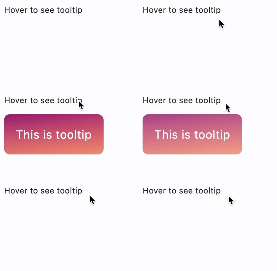
import math
import flet as ft
from flet import alignment

def main(page: ft.Page):
    page.title = "Tooltip Example"
    page.add(
        ft.Tooltip(
            message="This is tooltip",
            content=ft.Text("Hover to see tooltip"),
            padding=20,
            border_radius=10,
            text_style=ft.TextStyle(size=20, color=ft.colors.WHITE),
            gradient=ft.LinearGradient(
                begin=alignment.top_left,
                end=alignment.Alignment(0.8, 1),
                colors=[
                    "0xff1f005c",
                    "0xff5b0060",
                    "0xff870160",
                    "0xffac255e",
                    "0xffca485c",
                    "0xffe16b5c",
                    "0xfff39060",
                    "0xffffb56b",
                ],
                tile_mode=ft.GradientTileMode.MIRROR,
                rotation=math.pi / 3,
            ),
        )
    )

ft.app(target=main)
Properties
bgcolor
Background color of the tooltip.
border
Border around the tooltip.
border_radius
Tooltip's border radius.
content
The Control that should be displayed inside the tooltip.
message
The text to display in the tooltip.
enable_feedback
When True (default) the tooltip should provide acoustic and/or haptic feedback.
For example, on Android a tap will produce a clicking sound and a long-press will produce a short vibration, when feedback is enabled.
gradient
Background gradient of the tooltip. The value must be an instance of one of the following classes:
height
The height of the tooltip's content.
margin
The empty space that surrounds the tooltip. The value is an instance of margin.Margin class or a number.
padding
The amount of space by which to inset the tooltip's content.
The value is an instance of padding.Padding class or a number.
On mobile, defaults to 16.0 logical pixels horizontally and 4.0 vertically. On desktop, defaults to 8.0 logical pixels horizontally and 4.0 vertically.
prefer_below
Whether the tooltip defaults to being displayed below the control.
Defaults to True. If there is insufficient space to display the tooltip in the preferred direction, the tooltip will be displayed in the opposite direction.
shape
The shape of the tooltip. The value is BoxShape enum.
show_duration
The length of time, in milliseconds, that the tooltip will be shown after a long press is released or a tap is released or mouse pointer exits the control.
text_align
How the message of the tooltip is aligned horizontally.
Property value is TextAlign enum. Defaults to LEFT.
text_style
The TextStyle to use for the message of the tooltip.
vertical_offset
The vertical gap between the widget and the displayed tooltip.
wait_duration
The length of time, in milliseconds, that a pointer must hover over a tooltip's control before the tooltip will be shown.
Defaults to 0 milliseconds (tooltips are shown immediately upon hover).