Colors

Color value
There are 2 ways to define color property value in Flet: hex value and named colors.
Hex value
Hex value should be in format #aarrggbb (0xaarrggbb) or #rrggbb (0xeeggbb). In case aa (opacity) is omitted, it is set to ff (not transparent).
c1 = ft.Container(bgcolor='#ff0000')
Named colors
Named colors are the Material Design theme colors and colors palettes. They can be set with a string value or using flet.colors module.
c1 = ft.Container(bgcolor=ft.colors.YELLOW)
c2 = ft.Container(bgcolor='yellow')
Theme colors

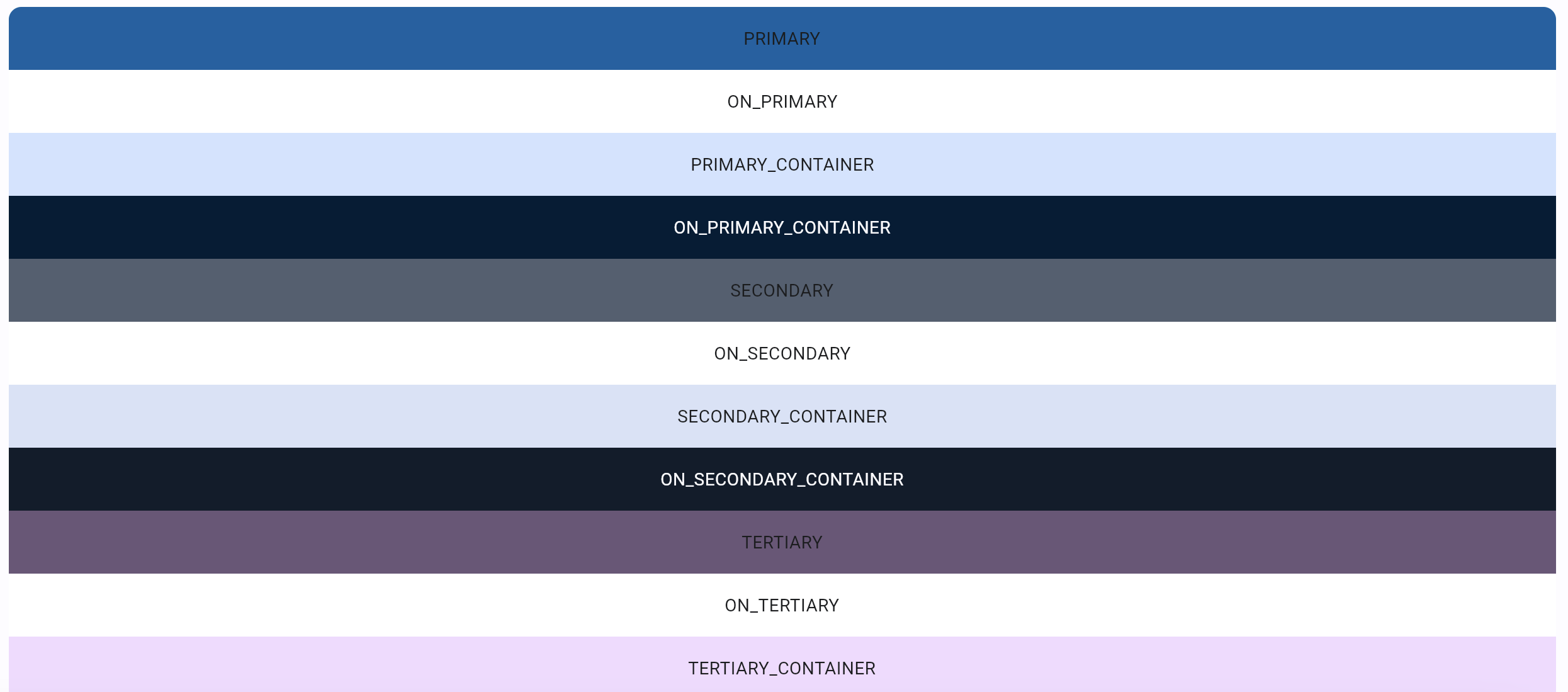
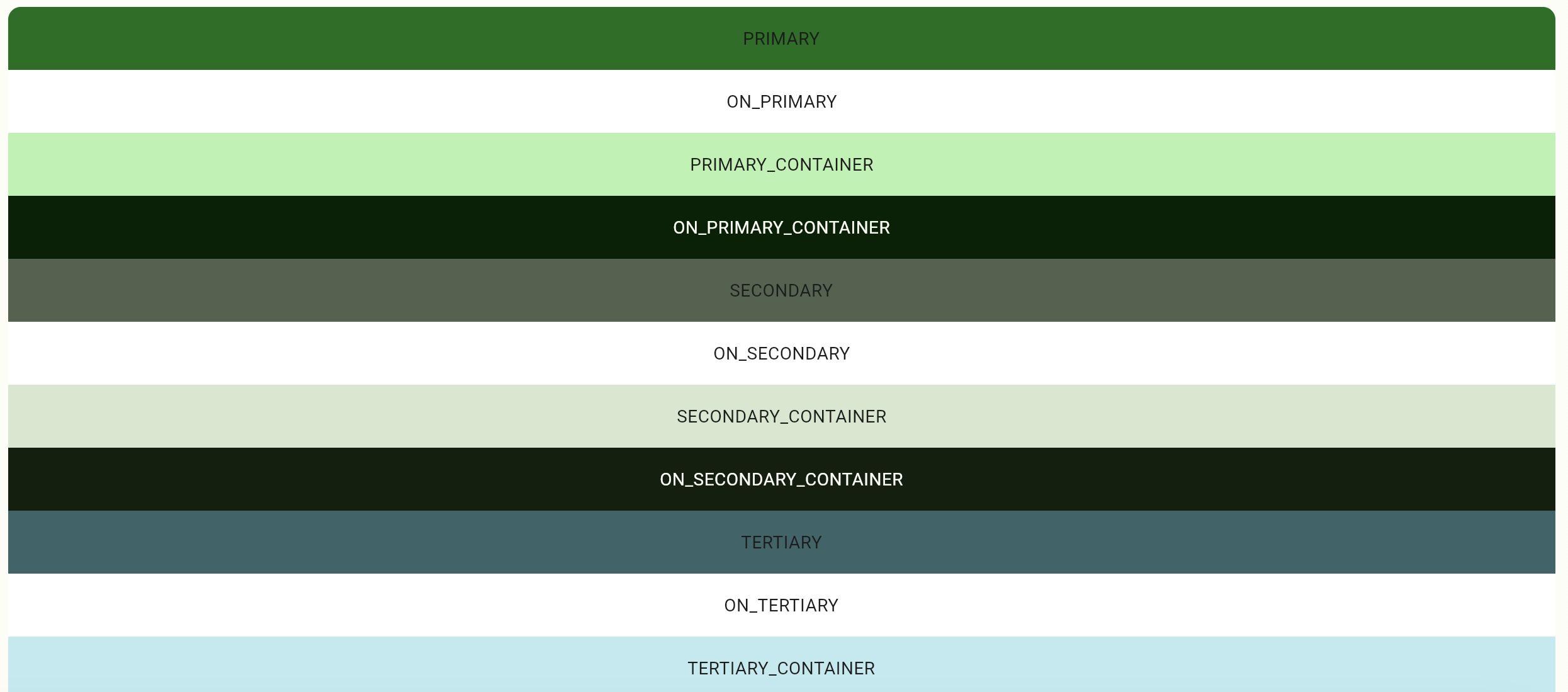
There are 30 named theme colors in Theme.color_scheme that are are generated based on the color_scheme_seed property. The default seed color value is "blue".
# example for generating page theme colors based on the seed color
page.theme = Theme(color_scheme_seed='green')
page.update()
Any of the 30 colors can be overridden, in which case they will have an absolute value that will not be dependent on the seed color.
page.theme = ft.Theme(
    color_scheme=ft.ColorScheme(
        primary=ft.colors.GREEN,
        primary_container=ft.colors.GREEN_200
        # ...
    ),
)

Theme colors define fallback colors for most of Flet controls.
Color palettes

Originally created by Material Design in 2014, color palettes are comprised of colors designed to work together harmoniously.
Color swatches (palettes) consist of different shades of a certain color. Most swatches have shades from 100 to 900 in increments of one hundred, plus the color 50. The smaller the number, the more pale the color. The greater the number, the darker the color. The accent swatches (e.g. redAccent) only have the values 100, 200, 400, and 700.
In addition, a series of blacks and whites with common opacities are available. For example, black54 is a pure black with 54% opacity.
Palette colors can be used for setting individual controls color property or as a seed color for generating Theme colors.
Color opacity
You can specify opacity for any color (hex value or named) using with_opacity method. Opacity value should be between 0.0 (completely transparent) and 1.0 (not transparent).
color = ft.colors.with_opacity(0.5, ft.colors.PRIMARY)
color = ft.colors.with_opacity(0.5, '#ff6666')
Another way to specify opacity for string value:
color = "surface,0.5"
For hex value, you can specify aa channel with values between 00 and ff, for example:
color = "#7fff6666"
Defining colors for Flet controls
Most Flet controls have default colors defined by the color_scheme that can be overridden on different levels.

Control level
If the color is defined on the control level, it will be used.
c = ft.Container(width=100, height=100, bgcolor=ft.colors.GREEN_200)
Not every Flet control has a color property that can be set on the control level. For example, FilledButton always has a default "primary" color defined by the nearest ancestor's theme.
Control Theme level
For ScrollBar (used in scrollable controls: Page, View, Column, Row, ListView and GridView), Tabs and Text controls, Flet will check if the nearest anscestor theme has ScrollBar Theme, Tabs theme or Text theme specified.
If you need to change theme for a particular ScrollBar, Text or Tabs control, you can wrap this control in a Container and customize scrollbar_theme, text_theme or tabs_theme for this Container theme.
Theme level
Flet will check for the nearest ancestor that has theme defined, and will take color from the ColorScheme. In the example below, the nearest anscestor for the FilledButton is Container, and the primary color that is used for the button will be taken from the Container's theme.
import flet as ft

def main(page: ft.Page):

    container = ft.Container(
        width=200,
        height=200,
        border=ft.border.all(1, ft.colors.BLACK),
        content=ft.FilledButton("Primary color"),
        theme=ft.Theme(color_scheme=ft.ColorScheme(primary=ft.colors.YELLOW))
    )

    page.add(container)

ft.app(target=main)
If control's color property, control-specific theme or nearest ancestor's theme is not specified, the nearest ancestor will be the page and the colors from the default page color_scheme will be used.