FloatingActionButton
A material design floating action button. A floating action button is a circular icon button that hovers over content to promote a primary action in the application.
Floating action button is usually set to page.floating_action_button, but can also be added as a regular control at any place on a page.
Examples
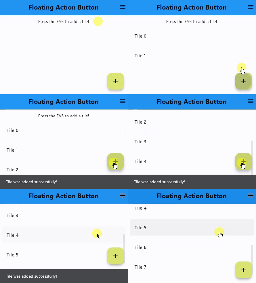
Basic FAB
- Python
import flet as ft

def main(page: ft.Page):
    page.title = "Floating Action Button"
    page.theme_mode = ft.ThemeMode.LIGHT
    page.horizontal_alignment = ft.CrossAxisAlignment.CENTER
    page.auto_scroll = True
    page.scroll = ft.ScrollMode.HIDDEN
    page.appbar = ft.AppBar(
        title=ft.Text(
            "Floating Action Button", weight=ft.FontWeight.BOLD, color=ft.colors.BLACK87
        ),
        bgcolor=ft.colors.BLUE,
        center_title=True,
        actions=[
            ft.IconButton(ft.icons.MENU, tooltip="Menu", icon_color=ft.colors.BLACK87)
        ],
        color=ft.colors.WHITE,
    )

    # keeps track of the number of tiles already added
    page.count = 0

    def fab_pressed(e):
        page.add(ft.ListTile(title=ft.Text(f"Tile {page.count}")))
        page.show_snack_bar(
            ft.SnackBar(ft.Text("Tile was added successfully!"), open=True)
        )
        page.count += 1

    page.floating_action_button = ft.FloatingActionButton(
        icon=ft.icons.ADD, on_click=fab_pressed, bgcolor=ft.colors.LIME_300
    )
    page.add(ft.Text("Press the FAB to add a tile!"))

ft.app(target=main)
Properties
autofocus
True if the control will be selected as the initial focus. If there is more than one control on a page with autofocus set, then the first one added to the page will get focus.
bgcolor
Button background color.
clip_behavior
The content will be clipped (or not) according to this option. Property value is ClipBehavior enum.
Defaults to NONE.
content
A Control representing custom button content.
disabled_elevation
The button's elevation when disabled. Defaults to the same value as elevation.
elevation
The button's elevation. Defaults to 6.
enable_feedback
Whether detected gestures should provide acoustic and/or haptic feedback. On Android, for example, setting this to True will produce a click sound and a long-press will produce a short vibration.
Defaults to True.
focus_color
The color to use for filling the button when the button has input focus.
focus_elevation
The button's elevation when it has input focus. Defaults to 8.
foreground_color
The default foreground color for icons and text within the button.
highlight_elevation
The button's elevation when being touched. Defaults to 12.
hover_elevation
The button's elevation when it is enabled and being hovered. Defaults to 8.
icon
Icon shown in the button.
mini
Controls the size of this button.
By default, floating action buttons are non-mini and have a height and width of 56.0 logical pixels. Mini floating action buttons have a height and width of 40.0 logical pixels with a layout width and height of 48.0 logical pixels.
mouse_cursor
The cursor to be displayed when a mouse pointer enters or is hovering over this control.
The value is MouseCursor enum.
shape
The shape of the FAB's border.
The value is an instance of OutlinedBorder class.
splash_color
The color of the ripple shown when this button is pressed/clicked.
text
The text displayed on a button.
tooltip
The text displayed when hovering the mouse over the button.
url
The URL to open when the button is clicked. If registered, on_click event is fired after that.
url_target
Where to open URL in the web mode. Value is of UrlTarget enum. Default is BLANK.
Events
on_click
Fires when a user clicks the button.