Flet 0.7.1 enables developers changing scroll position and receiving scroll notifications from Page, View, Column, Row, ListView and GridView controls.
The release also introduces theming improvements:
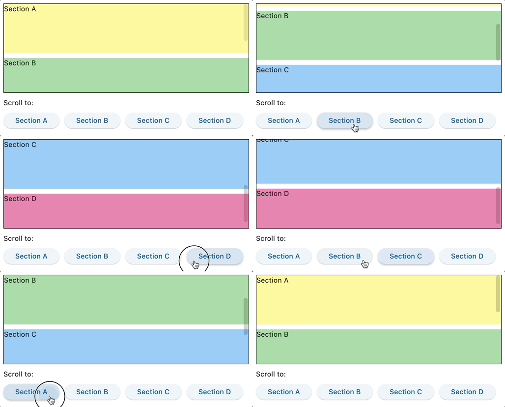
Scrollable controls (Page, View, Column, Row, ListView and GridView) introduce scroll_to() method to change their scroll position to either absolute offset, relative delta or jump to the control with specified key.
Moving to a key is particularly exciting as it allows simulating the navigation between page bookmarks, kind of HTML hrefs with #:

Check the source code of the example above.
See Column.scroll_to for more details about controlling scroll position.
All scrollable controls now provide on_scroll event handler which fires when a scroll position is changed. From event object properties you can determine whether scroll operation has started, finished, changed direction or scroll position went behind scrolling extent (overscroll). You can also get updates of the current scroll position as well as dimensions of the scroll area, for example:
import flet as ft

def main(page: ft.Page):
    def on_column_scroll(e: ft.OnScrollEvent):
        print(
            f"Type: {e.event_type}, pixels: {e.pixels}, min_scroll_extent: {e.min_scroll_extent}, max_scroll_extent: {e.max_scroll_extent}"
        )

    cl = ft.Column(
        spacing=10,
        height=200,
        width=200,
        scroll=ft.ScrollMode.ALWAYS,
        on_scroll=on_column_scroll,
    )
    for i in range(0, 50):
        cl.controls.append(ft.Text(f"Text line {i}", key=str(i)))

    page.add(
        ft.Container(cl, border=ft.border.all(1)),
    )

ft.app(main)
See Column.on_scroll for more details about scroll notification.
Check infinite scroll example.
Until today the only way to control color scheme for your application was specifying color_scheme_seed when creating a new ft.Theme object.
This release enables you to fine tune all 30 colors based on the Material spec and used by various Flet controls.

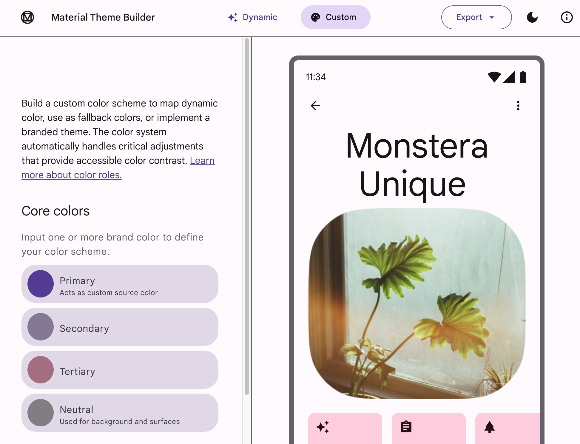
You can even use Material Theme Builder and apply exported color palette to your app, for example:
page.theme = ft.Theme(
color_scheme=ft.ColorScheme(
primary=ft.colors.GREEN,
primary_container=ft.colors.GREEN_200
),
)
See ColorScheme class for more details.
Another awesome feature of this release is nested themes!
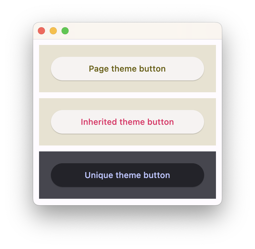
You can have a part of your app to use a different theme or override some theme styles for specific controls.
Remember page object having theme and theme_mode properties? Now Container has theme and theme_mode properties too!
Container.theme accepts the same ft.Theme object as a page. Specifying theme_mode in the container means you don't want to inherit parent theme, but want a completely new, unique scheme for all controls inside the container. However, if the container does not have theme_mode property set then the styles from its theme property will override the ones from the parent, inherited theme:
import flet as ft
def main(page: ft.Page):
page.theme = ft.Theme(
color_scheme_seed=ft.colors.YELLOW,
)
page.add(
ft.Container(
content=ft.ElevatedButton("Page theme button"),
bgcolor=ft.colors.SURFACE_VARIANT,
padding=20,
width=300,
),
ft.Container(
theme=ft.Theme(color_scheme=ft.ColorScheme(primary=ft.colors.PINK)),
content=ft.ElevatedButton("Inherited theme button"),
bgcolor=ft.colors.SURFACE_VARIANT,
padding=20,
width=300,
),
ft.Container(
theme=ft.Theme(color_scheme_seed=ft.colors.INDIGO),
theme_mode=ft.ThemeMode.DARK,
content=ft.ElevatedButton("Unique theme button"),
bgcolor=ft.colors.SURFACE_VARIANT,
padding=20,
width=300,
),
)
ft.app(main)

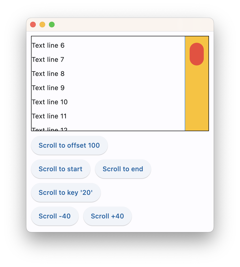
You can now customize the look and fill of scrollbars in your application (or a particular scroillbar with nested themes).
It could be done via page.theme.scrollbar_theme property, for example:
page.theme = ft.Theme(
    scrollbar_theme=ft.ScrollbarTheme(
        track_color={
            ft.MaterialState.HOVERED: ft.colors.AMBER,
            ft.MaterialState.DEFAULT: ft.colors.TRANSPARENT,
        },
        track_visibility=True,
        track_border_color=ft.colors.BLUE,
        thumb_visibility=True,
        thumb_color={
            ft.MaterialState.HOVERED: ft.colors.RED,
            ft.MaterialState.DEFAULT: ft.colors.GREY_300,
        },
        thickness=30,
        radius=15,
        main_axis_margin=5,
        cross_axis_margin=10,
    )
)

Text theming
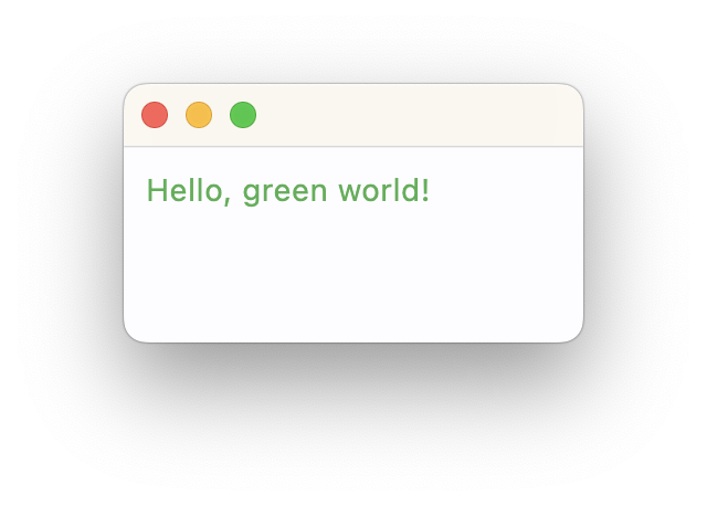
Material 3 design defines 5 groups of text styles with 3 sizes in each group: "Display", "Headline", "Title", "Label" and "Body" which are used across Flet controls. You can now customize each of those styles with page.theme.text_theme, for example:
import flet as ft

def main(page: ft.Page):
    page.theme = ft.Theme(
        text_theme=ft.TextTheme(body_medium=ft.TextStyle(color=ft.colors.GREEN))
    )

    page.add(ft.Text("Hello, green world!"))

ft.app(main)

Apparently, Body Medium is used by Text control as a default style.
See TextTheme class for more details.
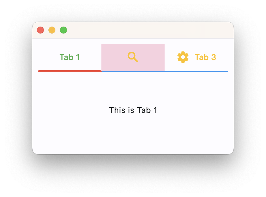
You can now control the look and feel of Tabs control. In this release Tabs adds a bunch of new properties and there is a new page.theme.tabs_theme property to style all tabs in your app:
page.theme = ft.Theme(
    tabs_theme=ft.TabsTheme(
        divider_color=ft.colors.BLUE,
        indicator_color=ft.colors.RED,
        indicator_tab_size=True,
        label_color=ft.colors.GREEN,
        unselected_label_color=ft.colors.AMBER,
        overlay_color={
            ft.MaterialState.FOCUSED: ft.colors.with_opacity(0.2, ft.colors.GREEN),
            ft.MaterialState.DEFAULT: ft.colors.with_opacity(0.2, ft.colors.PINK),
        },
    )
)

See TabsTheme class for more details.
This Flet release is based on Flutter 3.10 which brings new features, performance and size optimizations. As a result, most of Flet dependencies bumped their versions too, so if you notice any issues please let us know.
Color emoji support in web apps are back! In Flutter 3.7 color emoji were disabled in "CanvasKit" renderer (default in Flet) because of their font size (8 MB!) and returned back as an opt-in in Flutter 3.10. You can enable color emoji in server-driven app with use_color_emoji argument:
ft.app(main, use_color_emoji=True)
and use --use-color-emoji switch when publishing app as a static side.
That's all for today!
Upgrade Flet module to the latest version (pip install flet --upgrade) and let us know what you think!
